Over the past two years, design trends have done a 180. Clean, white kitchens and trade show exhibits alike have fallen out of favor, replaced instead by colorful, organic installations. What used to feel like a straight-up sales opportunity has now become a chance to connect, collaborate, and befriend.
We spoke with EDE’s own President and Creative Director, Greg Tivadar, and Ben Synborski, President of SYNDESIGN on the top trade show design trends they expect to see on the floor in 2022 and beyond.
6 Trade Show Design Trends to Watch
Our lives have changed drastically – and as always, art has imitated life and reflected these changes across interior design, graphic design, and more. As exhibitors return to the floor, we’ve seen six key trade show booth trends that appear to be a direct response to our collective experience over the past two years.
1. Make It Warm & Comfortable
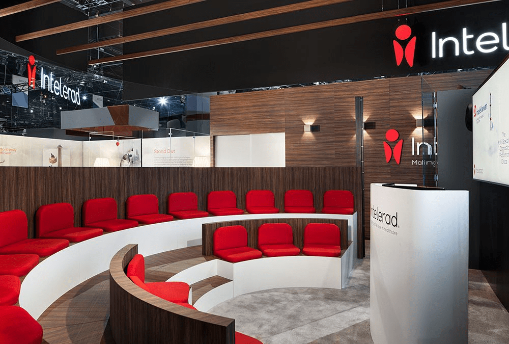
Pre-pandemic, white walls and clean lines felt safe and predictable. But these days, they feel lackluster at best and sterile at worst. Instead, we’re seeing warm colors, organic shapes, recycled materials, and low, cozy seating.
“I’m thinking about how everyone was gone for a year and a half, and now people are so relieved to be back at shows that I want to reward them with a comfortable experience,” says Ben Synborski. The goal is to create an experience that is equal parts impactful and enjoyable.
Play with organic elements and nod to the natural world. Trade white for warm neutrals. Swap conference room tables and metal chairs with plush seating. Replace flash with friendliness. And ensure that every change you make along the way communicates your brand intentionally.
2. Focus on Flow
Recent trade show design trends are all about putting people first – and one of the best ways to do so is to spend time understanding attendees’ physical journeys through your space.
So many exhibitors focus all of their efforts on getting attendees to their space. But what happens once they’re there?
Consider these questions when designing your exhibit layout:
- Where are the most logical entry and exit points?
- In which direction will most traffic flow?
- What is the focal point of the exhibit? Where should it be placed for optimal access?
- What elements support the focal point? How can they be best oriented?
Furthermore, think about the attendee journey after the show is over. How will you be remembered? How can you re-engage with the potential buyers and customers you meet in order to reach your goals?
3. Use Lighting Intentionally
As part of the shift to warmer, more inviting spaces, we’ve also seen a huge increase in attention to lighting. Long gone are the days of adding a few standard bulbs to make your product pop. You’ll need to choose your lighting intentionally to make the most of your exhibit design.
Recent trade show design trends have introduced more complex lighting setups we’re familiar with from our background in museum exhibit design. Experiment with colored lighting, or with unexpected color combinations. Try low, subtle lighting to give attendees a break from the flashy, “Times Square” feeling so prevalent at trade shows. Project lighting on a textured material or unexpected surface.
The best lighting creates a focal point, without becoming the focal point itself. No matter what you explore with lighting, exercise control and focus on how lighting can create a more impactful experience for attendees.
4. Consider “Second Screen” Experiences
If you’ve ever sat on your phone while watching TV or a movie, you’ve experienced the second screen phenomenon firsthand. A second screen is typically a personal technology device that enhances or augments your experience with information on a primary screen – and we expect it to be a huge trade show design trend in coming years.
After years of watching attendees walk around the trade show floor with their noses in their phones, many exhibit designers have started to lean into the second screen phenomenon with:
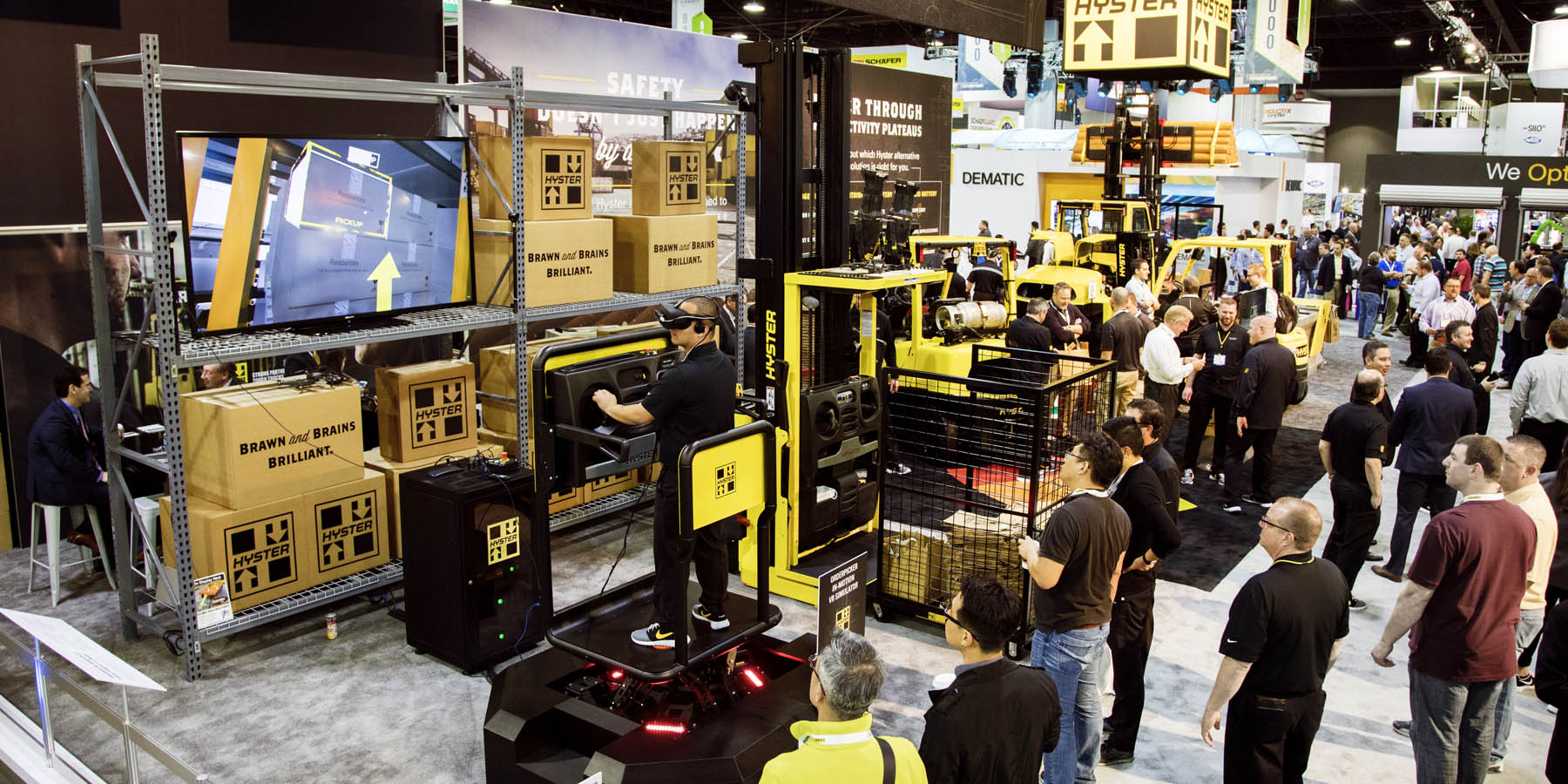
- Virtual reality experiences
- Interactive exhibits that connect with your smartphone
- Touchscreens and interactive displays
- RFID technology
This trend is still in its infancy, but we expect to see exhibits in the next few years that explore how they can communicate with attendees through their phones – and how phones can be a point of reconnection post-show.
In the meantime, we’ve been experimenting with other technology like RFID bracelets that provide access to MHS’s “Club MHS” speakeasy at the back of their booth. The bracelets offered an affordable touchpoint that helped attendees physically interact with the space.
5. Let Data Speak for Itself
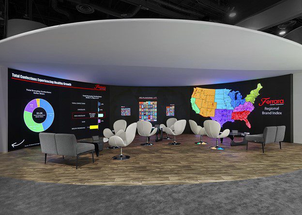
Data and analytics are an especially powerful tool with next generation decision-makers. Analytical design has emerged as a popular trade show design trend that uses information to drive traffic to your trade show exhibit.
We’ve used LED screens to convey tangible metrics and statistics for a number of our clients over the past few years. The information on these screens makes a strong first impression, opens the door to conversation, and resonates with attendees long after the event. And, the real magic happens when you pair data with messaging to tell an engaging story about who you are, what you do, and why attendees should care.
6. Design on Every Level
If you’ve ever walked a show floor, you’re likely familiar with the visual levels of trade show exhibits, even if only subconsciously.
At the top of your field of view, you’ll find:
- Signage
- Branding
- Lighting
On the ground level, you’ll find:
- Exhibits and installations
- Furniture
- Screens and displays
But in the mid-level of your field of view, you’ll find almost nothing, making it a huge opportunity for exhibitors to stand out.
If you’re not looking to capitalize on the mid level, put your time and energy into the lower level. Exhibitors often overlook details like flooring and elements below eye level, but attendees are constantly looking down at their phones, making it another opportunity to stand out.
Is your flooring a barrier to welcoming customers? Or does it create a high-end vibe to your space that drives meaningful conversations? Asking questions as simple as these can make a massive difference in your space.
Want to take your exhibit to the next level with some of these trade show booth design trends? Check out our portfolio of work for inspiration in any industry.


