After virtual shows in 2021, the floor was packed at IBS/KBIS 2022. Our team hit the floor to check out current exhibit design trends and also to give out some honorary virtual awards to our favorite booths.
Themes on the Trade Show Floor
As we walked the floor, we saw a number of trends and similarities across exhibits, including:
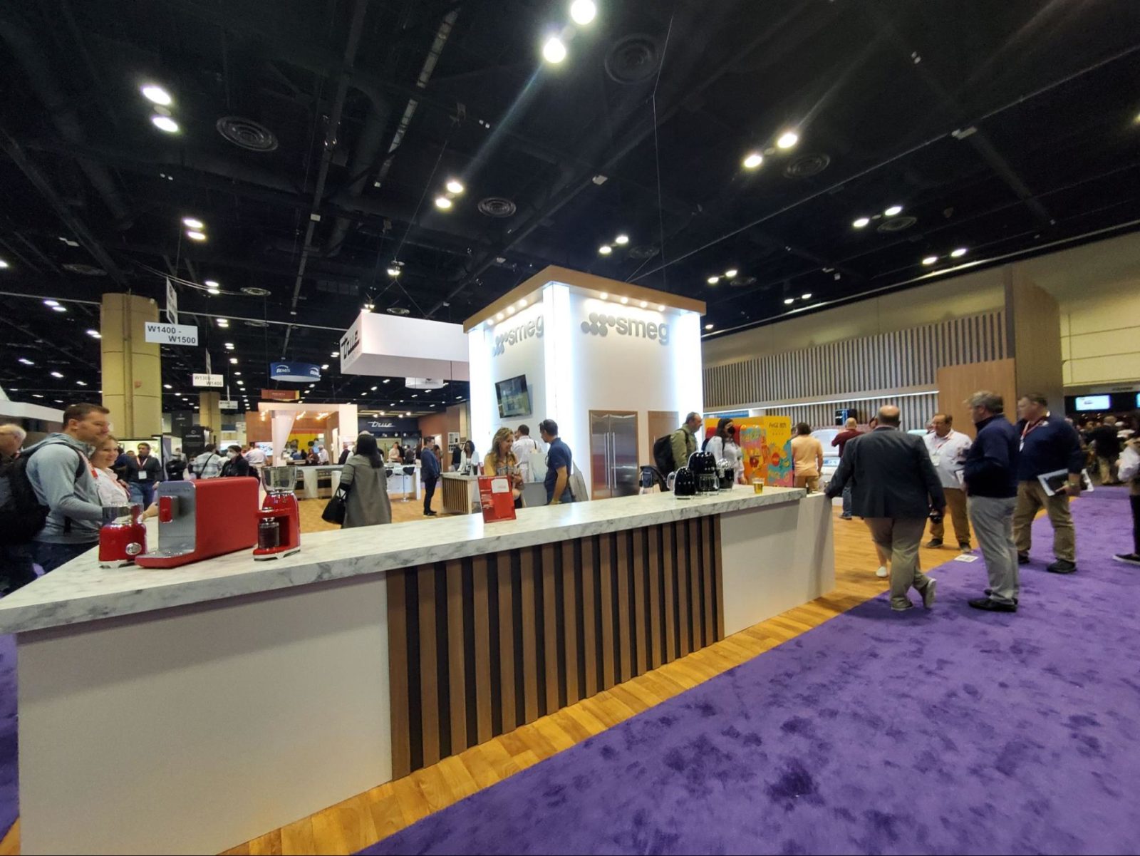
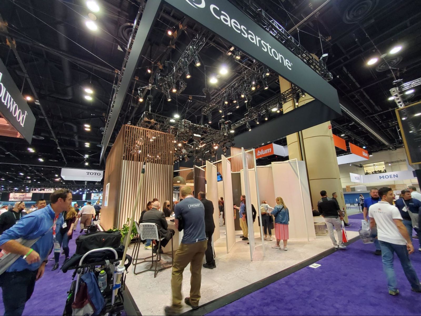
- Slatted wood panels – We saw this design trend everywhere at IBS/KBIS 2022. While it brought warmth to the exhibits, it was so popular that it failed to help anyone stand out. And, we noticed that depending on the spacing and scale, this trend can be a little hard on the eyes.
- Raised flooring – Raised floors are big in Europe, and we saw a number of exhibitors experimenting with them. Unfortunately, they are highly inaccessible and can also become a tripping hazard.
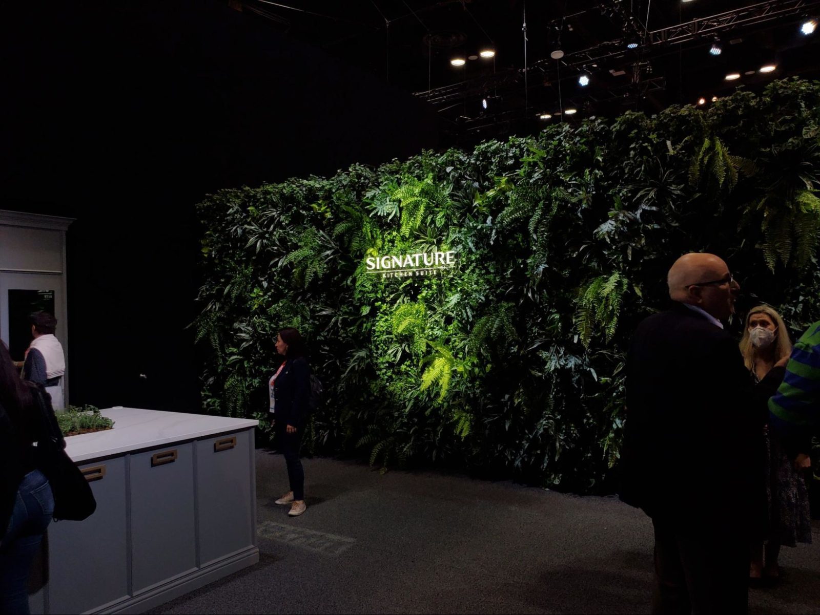
- Greenery – A number of exhibits featured greenery and we loved the natural touch it added throughout the floor.
- Hanging “ceilings” – Across the floor we saw several exhibits utilize hanging signage or fabric panels to simulate a lower ceiling and make their spaces feel more homey. The trend works, and we expect to continue to see it for years to come.
- Exhibit layouts – When it came to booth layout, the floor was split. While we saw plenty of open-plan designs, we also saw a huge number of linear designs with a single entrance and exit.
Best of Show
While our team was impressed with exhibits across the floor at IBS/KBIS 2022, there was one exhibit that truly stood out. Check out the exhibit we voted best of show (as well as two honorable mentions).
Best of Show – GE
GE showed up with one of our favorite booths (designed by Deckel & Moneypenny) and earned a well-deserved IBS/KBIS best of show – and an honorary best of show from us. We loved the dark aesthetic throughout their space and that they didn’t shy away from doing something truly different.
Their exhibit featured hanging screens that set that tone for their entire space with animated branding elements. Their lighting setup was spot-on for the show and truly stood out.
We also loved their product vignettes throughout the exhibit. They used technology heavily to highlight their products, something that other IBS/KBIS exhibitors typically shy away from. But, they did it so simply and intentionally that it didn’t feel gaudy or over the top.
We didn’t get a chance to try their VR experience firsthand because the space was packed with attendees also waiting to try it. While we were a little surprised with the demand given that COVID is still on many attendees’ minds, we were impressed by the setup.
Honorable Mention – Kohler
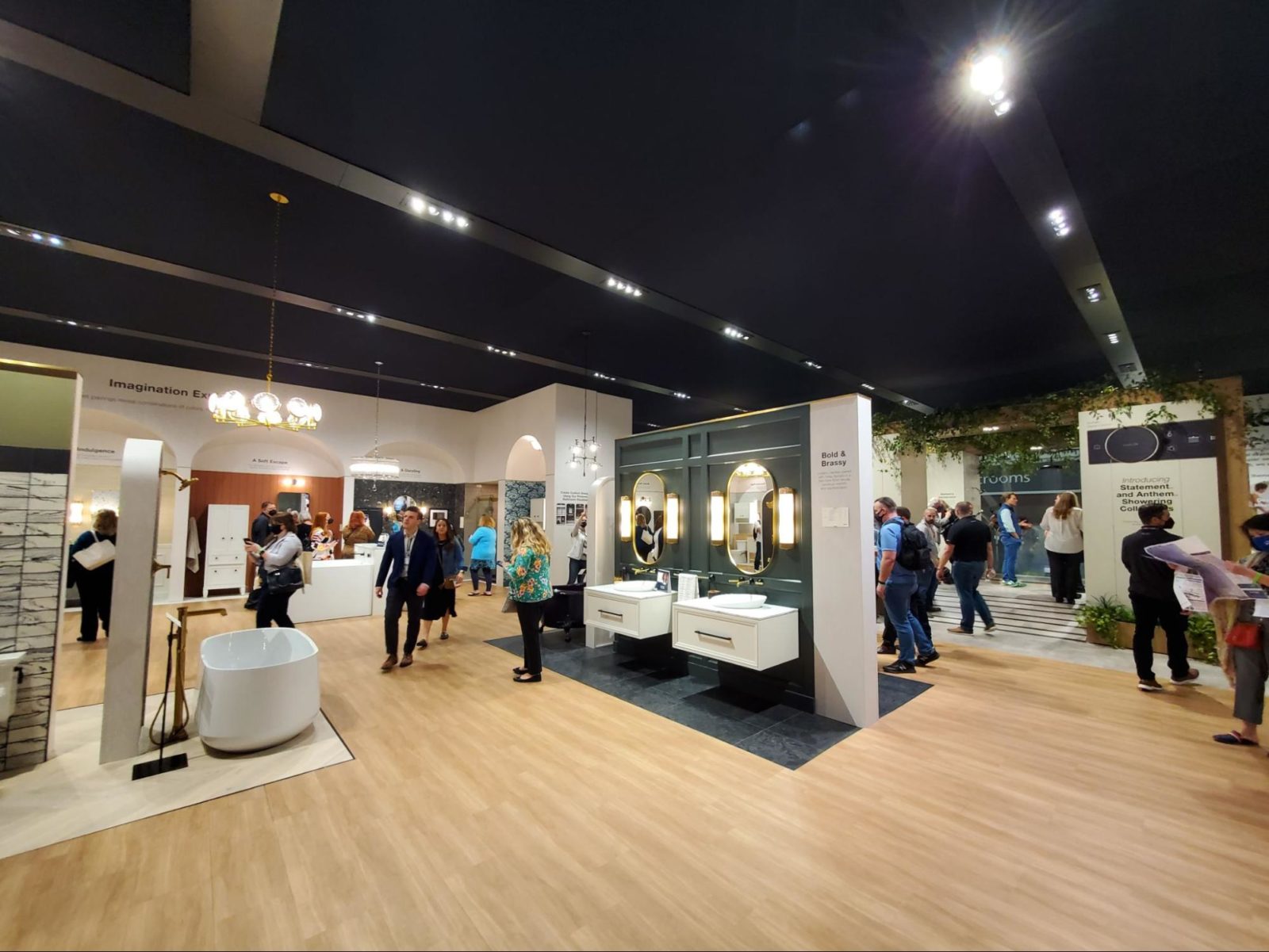
Kohler’s exhibit made a huge impact at IBS/KBIS 2022 thanks to its massive footprint and intentional design. The 12,000+ square foot exhibit featured dozens of vignettes, a stage, and even an intercom system.
The entire exhibit was covered by a fabric canopy that transported you off the show floor and into what felt like a permanent Kohler showroom with vignettes from an immaculately-designed home. We can only imagine the complexity of the logistics behind the exhibit, with functioning bathtubs, showers, and sinks running water throughout.
Honorable Mention – Cosentino
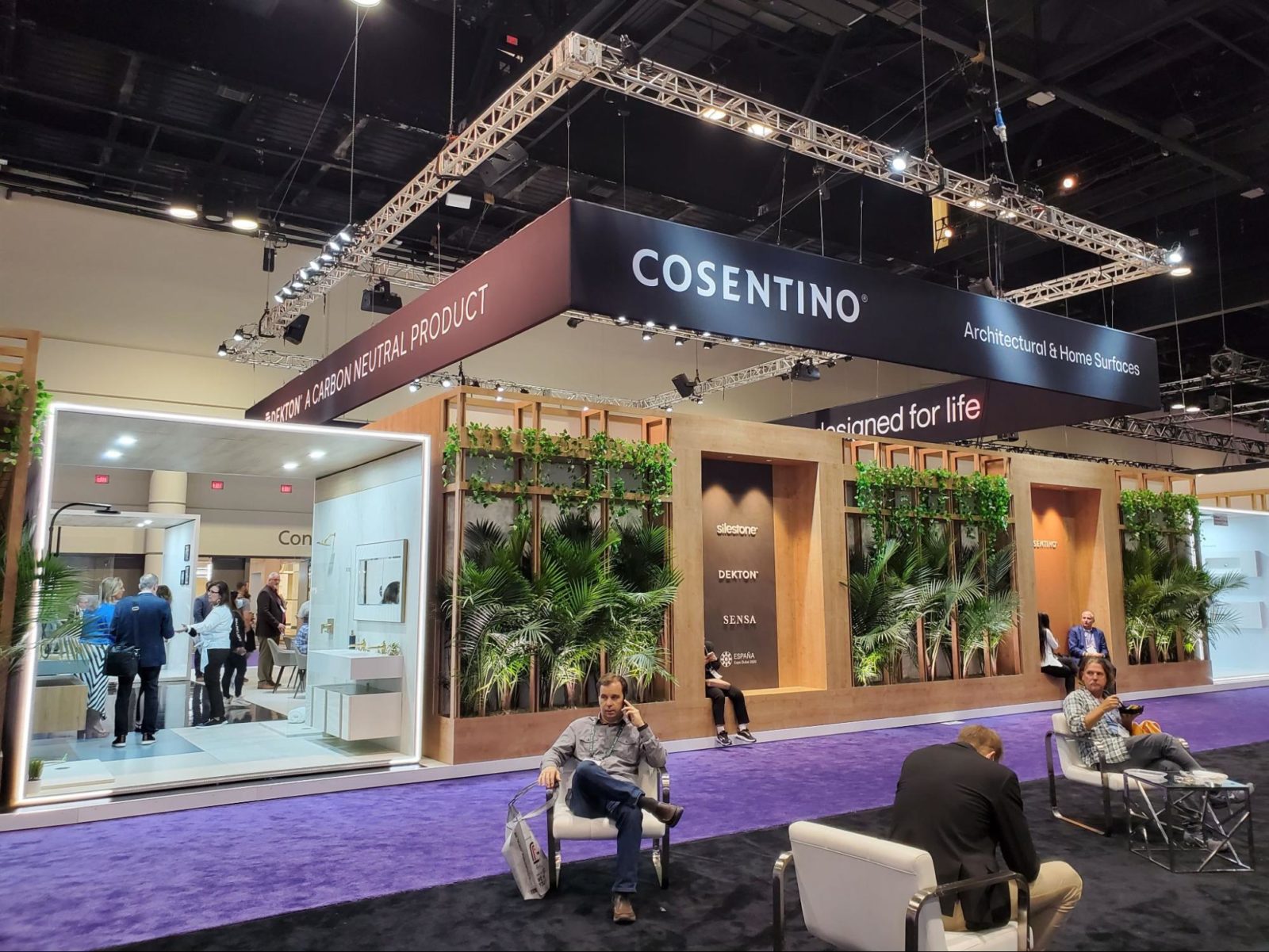
Our team really loved the Cosentino booth at IBS/KBIS 2022 – and the circumstances worked perfectly in their favor. Many attendees were looking forward to a warm, sunny trip to Orlando. But for the first two days of the show, the city was gray, rainy, and miserable.
Cosentino’s use of tropical greenery brought the outdoors in and gave attendees the typical Florida vibes they were hoping for. In particular, we appreciated their use of greenery paired with light wood tones for a fresh and bright aesthetic.
Best Product Demo
In addition to looking for the best overall exhibit, we always keep an eye out for product demos, vignettes, and displays that really wow us.
Best Product Demo – LP Building Solutions
LP Building Solutions exhibited one of the most impactful (and likely cost-effective) product demos we’ve ever seen at IBS/KBIS. The display demonstrated how durable their SmartSide siding was by pelting it with baseballs thrown by a baseball pitching machine.
The result was visually impactful – the ground beneath the traditional fiber cement siding was littered with damage while the SmartSide remained pristine. But what we really loved was the sheer volume of the demo, which made it truly impossible to ignore.
Honorable Mention – Whirlpool
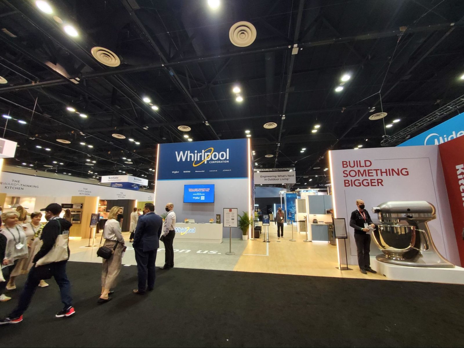
While not exactly a true product demo, we can’t help but love Whirlpool’s giant stand mixer that was on display at IBS/KBIS 2022. Every time we went by to snap a picture, there were people in the way, and we don’t blame them. It’s fun, it’s different, and it’s a great photo op.
The Best of the Rest
These exhibits didn’t make the top of our list, but we still wanted to recognize them for their unique approaches, elements, or technologies.
Caesarstone
While Caesarstone did opt for a raised platform at IBS/KBIS 2022, they kept it low and added a ramp around the entire perimeter of the exhibit. They proved that with a little extra effort, you can make pretty much any design decision more accessible.
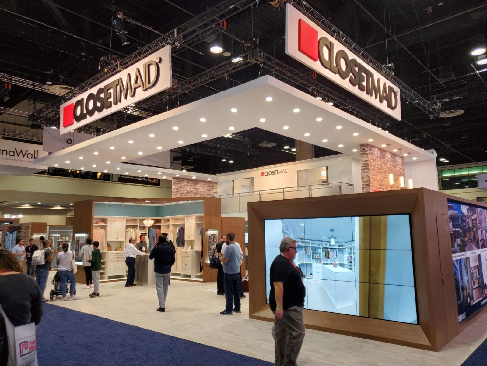
ClosetMaid
Overall, our team really liked the homey, comfortable feel of the ClosetMaid booth. It immersed you in their product with thoughtful lighting and a functional layout that felt more like a nice department store than a trade show floor. We especially liked their use of brick and their hanging signs that added a “ceiling” without feeling claustrophobic.
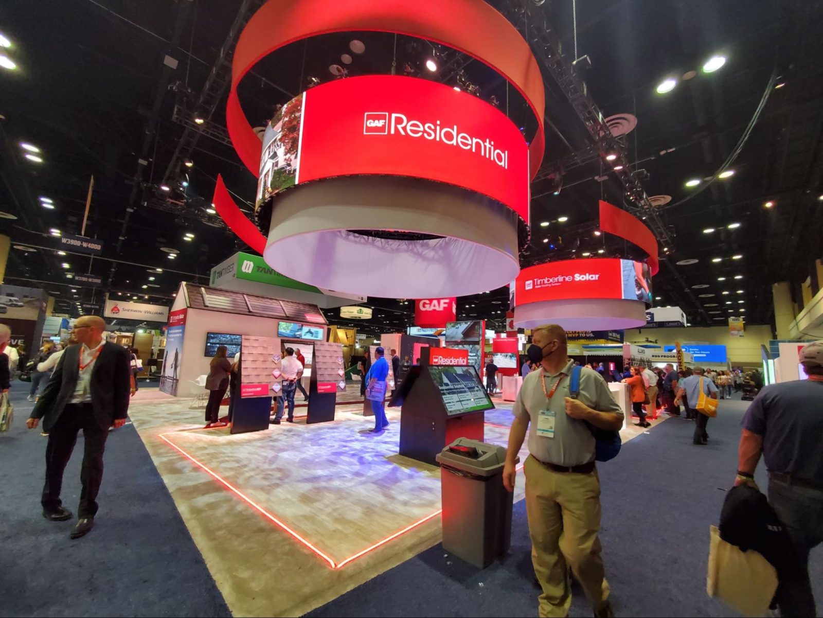
GAF
GAF really leaned into technology in their exhibit and it paid off big-time. In particular, we were impressed with their “rotating” LED screens that utilized motion graphics rather than mechanically rotating the entire sign rig. We also loved the interactivity of their “whack-a-mole” game that kept the area busy for the majority of the show.
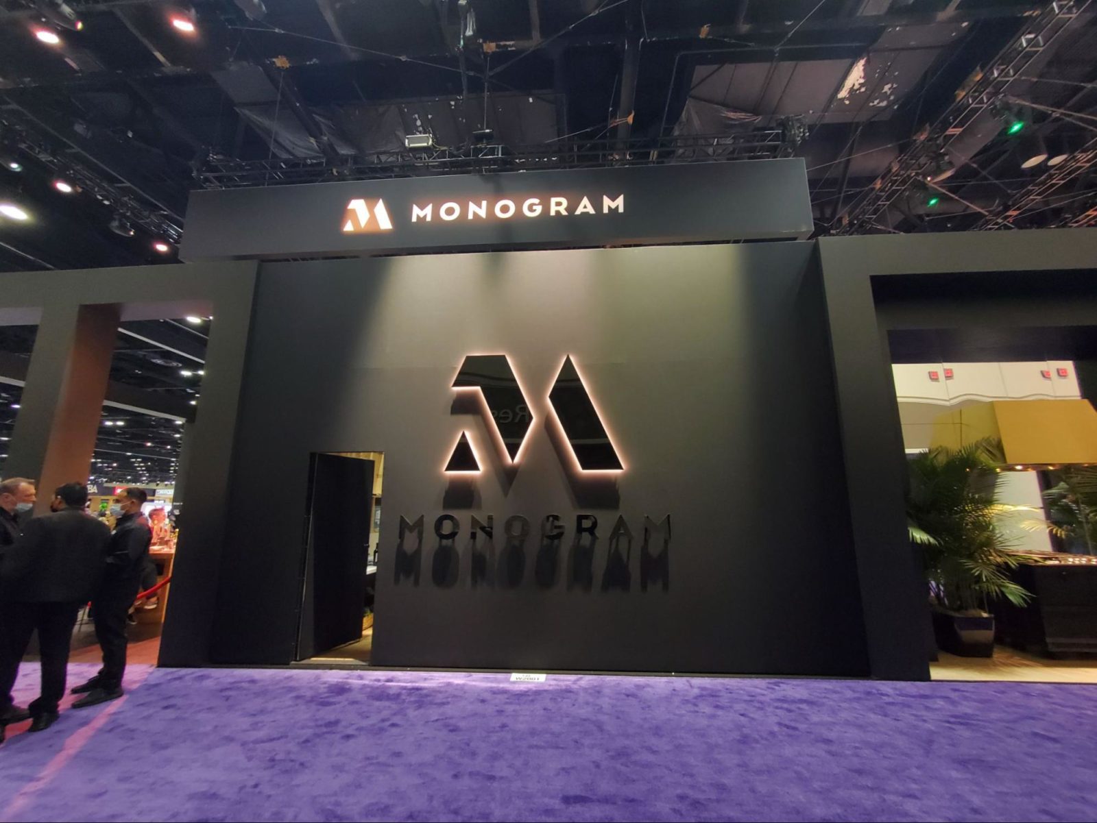
Monogram
The Monogram booth was unique in its exclusivity. While other booths welcomed attendees in, Monogram felt more like an elite club. The tasteful exterior paired simple black structures with greenery, piquing our curiosity (and the interest of many attendees) for the duration of the show.
Signature
While a number of exhibits featured walls of greenery, Signature gets a shoutout for being perhaps the only one to opt for live plants instead of fake. We loved the contrast of the green against the dark exhibit, the false aisle that led you back into more of their booth, and the overall vibe of their space.
